When you write a review, you’re not just talking to people who see the screen. You’re also writing for someone who hears every word through a screen reader. For them, your carefully crafted sentence about the film’s lighting might sound like a jumbled mess if you used italics to emphasize it, or if you said "Click here" instead of naming what they’re clicking. Accessibility in criticism isn’t a bonus-it’s the baseline for honest, fair, and complete feedback.
Why Accessibility Matters More Than You Think
Over 96% of websites fail basic accessibility checks, according to WebAIM’s 2023 scan of a million home pages. That means most reviews, whether on blogs, streaming platforms, or news sites, are broken for people using screen readers. The biggest problems? Low contrast text (83.5% of sites), missing image alt text (62.6%), and confusing link text like "Read more" or "Learn more." These aren’t just technical glitches-they silence real people.
Imagine trying to understand a movie review where every link says "Click here," every heading skips from H1 straight to H4, and the color of the text blends into the background. You can’t tell if the reviewer loved the cinematography or hated the plot. You can’t even find the star rating. That’s not a bad review-it’s an inaccessible one.
Accessibility isn’t about pity. It’s about fairness. The Web Content Accessibility Guidelines (WCAG) 2.1, updated in 2018 and expanded in 2023 with WCAG 2.2, were never meant to be a checklist for legal compliance. They’re a framework for clear communication. When you write accessibly, you make your review easier for everyone: people with low vision, dyslexia, attention disorders, or even those scrolling on a phone in bright sunlight.
How Screen Readers Actually Work
Screen readers don’t "read" text like a person. They parse structure. If you write a review using <div> tags for buttons or headings, the screen reader won’t know what’s important. It treats a <div> like a blank space. But if you use a <button> or <h2>, it announces it clearly: "Button, Rate this movie," or "Heading level 2, Plot Summary."
That’s why semantic HTML matters more than fancy fonts. A screen reader user doesn’t care if your font is Helvetica or Times New Roman. They care if they can navigate from the cast list to the director’s note without getting lost. They care if the review’s structure follows a logical order: title, summary, strengths, weaknesses, rating, conclusion.
And don’t assume they know what "the left sidebar" means. If your layout changes on mobile-which it always does-the phrase "click the option on the right" becomes useless. Instead, say: "Select the color filter under the video player." Specificity is kindness.
Writing for Clarity: Plain Language Is Your Best Tool
Complex words don’t make you sound smarter. They make your review harder to follow. The SBA Office of Advocacy says it plainly: "Write short sentences. Use familiar words. Avoid jargon and slang."
Replace "the film’s mise-en-scène is profoundly evocative" with "the way the scene is set-colors, lighting, props-creates a feeling of loneliness." You’re not dumbing it down. You’re opening it up.
Same goes for acronyms. Never use "HDR" or "Dolby Atmos" without spelling them out first: "High Dynamic Range (HDR) makes the bright scenes pop without losing detail in shadows." Then you can use the shortcut later.
And ditch ableist language. Phrases like "blindly follows the plot" or "crazy twist" aren’t just offensive-they’re confusing. A person with a visual impairment doesn’t need their disability used as a metaphor. Say "unpredictable twist" instead. Say "surprising" instead of "insane."
Formatting That Works for Everyone
Here’s what actually works:
- Font: Use sans-serif fonts like Arial, Calibri, or Verdana. They’re easier to read on screens and for screen readers to interpret.
- Size: Body text should be at least 12 points. For printed reviews or PDFs, aim for 14 points.
- Alignment: Left-align your text. Justified text creates uneven gaps between words, which screen readers and people with dyslexia struggle with.
- Color: Black text on white background is the gold standard. Avoid red-on-green or light gray-on-white. Use a contrast checker to make sure your text passes WCAG 2.1 AA standards.
- Formatting: Never use underlines for emphasis-they’re reserved for links. Don’t use all caps. Italics are okay sparingly, but don’t rely on them to convey meaning. Screen readers don’t change tone for italics.
Lists are your friend. If you’re listing strengths or weaknesses, use bullet points-not dashes or line breaks. Screen readers announce "list with 5 items," helping users understand scope and structure. A paragraph full of comma-separated traits? That’s a maze.
Links, Images, and Buttons: The Hidden Landmines
Every link should tell you where it goes. "Click here" is the worst offender. Instead:
- Bad: "Click here for the trailer."
- Good: "Watch the official trailer on YouTube."
Same with buttons. If you’re asking readers to rate a movie or leave a comment, make sure it’s a real <button> element-not a styled <div>. Screen readers need that semantic cue to know it’s interactive.
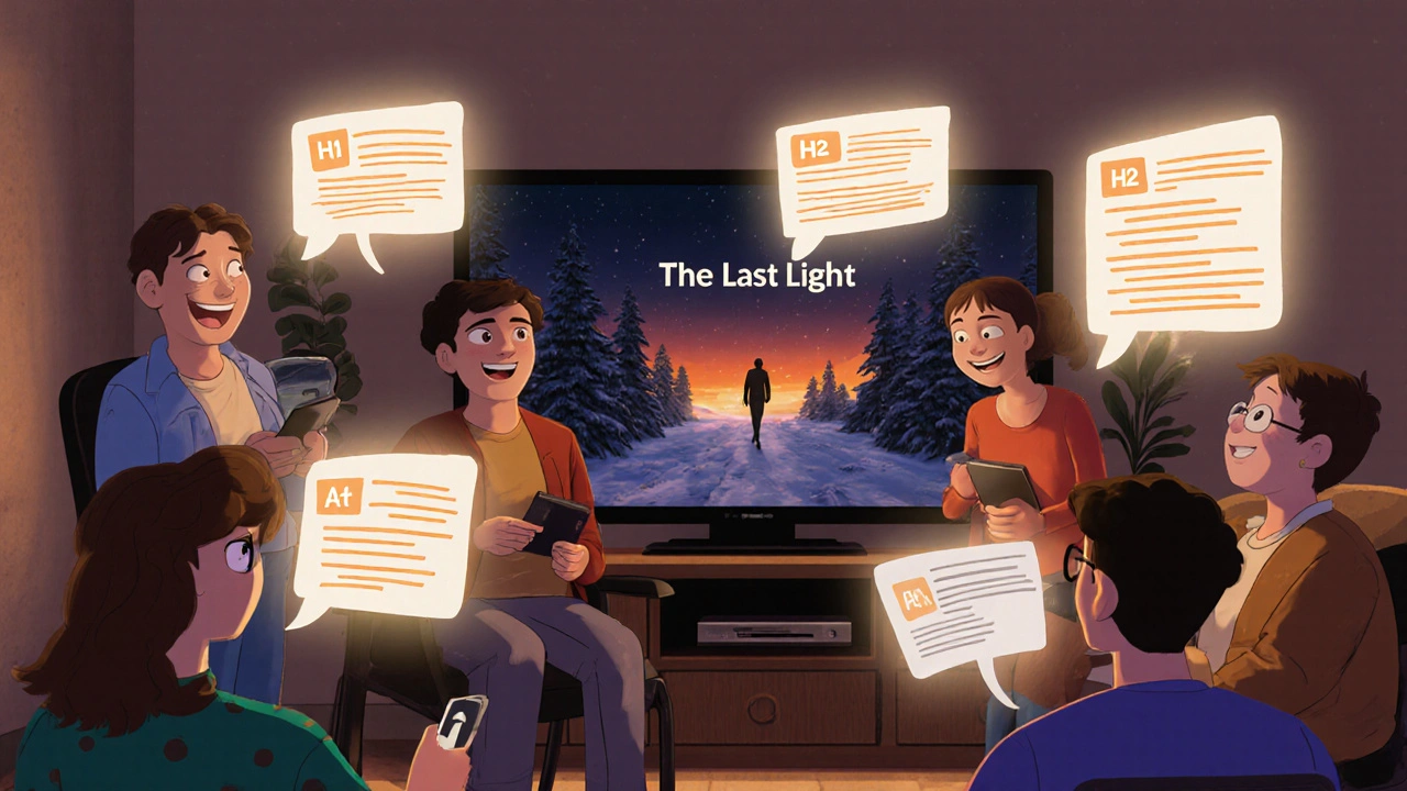
And images? Always add alt text. Not "movie poster," but "Poster for the film 'The Last Light,' showing a lone figure walking through a snowy forest under a dim orange sky." That’s not just helpful-it’s powerful. It lets someone who can’t see the image still feel the mood you’re describing.
Tables and Structure: Don’t Guess, Plan
If you’re comparing two films side-by-side in a table, make sure the headers are clear. A screen reader needs to know which column is "Director," which is "Runtime," which is "Rating." Use <th> for headers and <td> for data. Don’t use tables for layout. That’s a trap.
And never skip heading levels. H1 for the review title, H2 for major sections like "Plot," "Acting," "Cinematography," H3 for subsections. Skipping from H1 to H3 confuses screen readers. It’s like walking into a building and finding stairs missing between floors.
What’s Changing in 2025
WCAG 3.0 is expected to launch in late 2025, with new guidelines focused on cognitive accessibility-something even WCAG 2.1 admits it doesn’t fully solve. That means future reviews will need to account for people with learning disabilities, memory issues, or attention challenges. Simple things: shorter paragraphs, consistent layout, clear action steps.
Tools are catching up too. Microsoft Word now flags "color-only cues" and missing alt text. Mailchimp’s email builder warns you if your link text is vague. These aren’t gimmicks-they’re guardrails for better writing.
By 2025, 80% of major content platforms will have automated accessibility checks built in. That doesn’t mean you can relax. It means the bar is rising. If you’re still writing reviews the way you did in 2018, you’re already behind.
Start Small. Write Better.
You don’t need to overhaul every review you’ve ever written. Start with one thing:
- Change "Click here" to a descriptive link.
- Add alt text to your next image.
- Use a heading structure-H1, H2, H3-in your next review.
- Replace "crazy" or "blind" with a more accurate word.
- Check contrast with a free tool like WebAIM’s Contrast Checker.
Each of these steps takes under a minute. But together, they turn a review from something that excludes into something that includes. That’s not just good practice. That’s good criticism.
Accessible writing isn’t about checking boxes. It’s about respecting the person on the other side of the screen-who might be listening to your words instead of reading them. And they deserve to hear the full story, clearly, without having to guess what’s missing.
What’s the most common accessibility mistake in movie reviews?
The most common mistake is using vague link text like "Click here" or "Read more." Screen readers announce links in isolation, so if a user hears "Click here" 10 times, they have no idea where any of them lead. Always name the destination: "Watch the director’s interview," "See the full cast list," "Read the studio’s official statement."
Do I need to use special software to write accessible reviews?
No. You can write accessible reviews in any tool-Word, Google Docs, WordPress, or even a plain text editor. What matters is how you structure your content: proper headings, descriptive links, alt text for images, and plain language. Many tools now have built-in accessibility checkers (like Word’s Accessibility Checker), but you don’t need them to start doing the right thing.
Is accessible writing only for people with disabilities?
No. Accessible writing helps everyone. People reading on a phone in sunlight benefit from high contrast. People with dyslexia benefit from left-aligned text and simple words. People multitasking benefit from clear structure and short paragraphs. Accessibility isn’t a niche-it’s better communication for all.
How do I check if my review is accessible?
Use free tools like WebAIM’s Contrast Checker for text color, or the Axe browser extension to scan your webpage for missing alt text, heading issues, and non-semantic buttons. For Word or Google Docs, run the built-in Accessibility Checker. You can also read your review aloud with your device’s screen reader-this is the best way to hear what someone with visual impairment actually experiences.
What if I’m reviewing a film that’s visually complex-how do I describe it accessibly?
Focus on mood, movement, and meaning, not just visuals. Instead of "The scene is filled with red and gold," say "The scene feels warm and intense, with characters moving slowly through a room lit by flickering candlelight, creating a sense of quiet tension." Use sensory language-sound, texture, emotion-that anyone can imagine, regardless of sight.